

SG Name Card Team
Updated September 2026 · 6 min readThe Two-Second Pause
Imagine handing your card to a potential client at a busy conference. They take it, pause for two full seconds, feel the weight of the cardstock, and take a genuine look at your brand. That brief pause is where real connections start.
Most cards never earn it. People cram them full of four phone numbers, two physical addresses, social media handles and generic graphics. When everything competes for attention, nothing stands out. If you want your card to work as an actual networking tool, it needs to make a clean, confident statement.
5 Practical Design Concepts That Get Noticed
Prioritise Tactile Weight Over Bright Colours
People react to physical texture long before they read the actual words. Instead of relying on neon colours or noisy patterns, invest in heavy cardstock (400gsm or higher). When a card feels sturdy, has a soft-touch matte finish, or features debossed lettering, it instantly signals quality before someone even reads your name.
Leverage Dark, High-Contrast Palettes
Standard white cards easily blend into the stack of twenty others collected during an event. Switching to a deep charcoal, midnight navy or matte black background completely changes the visual tone. Pairing a dark backdrop with crisp white typography or subtle metallic accents gives your brand an elevated, executive presence.
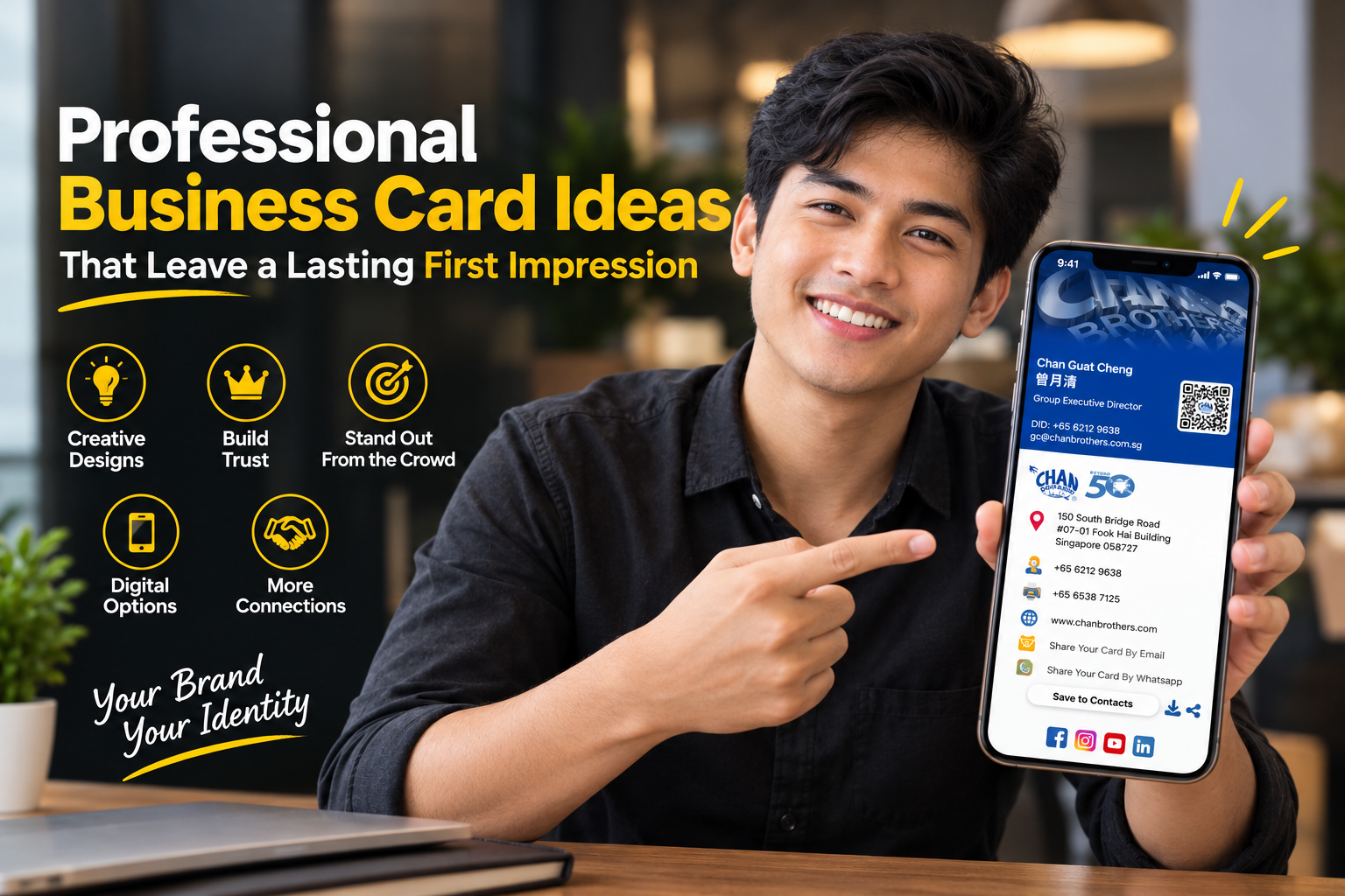
Integrate Smart Digital Touchpoints
Your physical card does not need to hold your entire life story. Keep the front completely clean with your core identity, and let digital tools do the heavy lifting on the back — custom dynamic QR codes that direct prospects straight to your portfolio, booking calendar or landing page, and virtual profile hubs that let contacts scan your card and save your Virtual Contact File (VCF) directly into their phonebook.
Experiment with Vertical or Square Formats
Over 90% of cards are handed out in a standard horizontal layout. Rotating your design 90 degrees into a vertical layout creates an immediate, subtle point of difference that mirrors the natural orientation of a smartphone screen. Alternatively, a square format (such as 65mm × 65mm) projects an architectural, creative personality.
Choose Textured or Recycled Cotton Cardstock
If your brand emphasises sustainability, craftsmanship or personal service, step away from glossy plastic lamination. Uncoated cotton paper or FSC-certified recycled stocks offer a warm, tactile feel that communicates authenticity and care.
Matching Design Style to Your Industry
Your design choices should align directly with client expectations in your field:
| Industry Sector | Recommended Card Style | Primary Goal |
|---|---|---|
| Finance, Law & Wealth | Heavyweight stock, classic typography | Builds trust, stability and authority |
| Real Estate & Luxury | Dark matte finish with foil accents | Projects high-end exclusivity |
| Tech & SaaS Startups | Vertical orientation with dynamic QR links | Communicates modern efficiency |
| Design & Creative Studios | Square shape or high-contrast layout | Displays confidence in visual taste |
| Wellness & Boutique Brands | Uncoated cotton paper in muted tones | Feels approachable, organic and authentic |
Core Layout Rules for Maximum Clarity
Protect Negative Space
Leave at least 40% of the card completely blank. Whitespace gives the eye a resting place and brings immediate focus to your key details.
Two Font Weights Only
Avoid mixing three or four typefaces. Stick to one clean family — Bold for your name, Regular for your job title and contact line.
Separate Your Messaging
Front: logo, full name, job title and direct phone line. Back: QR code, website URL or company tagline.
Simple Pre-Print Check
Before committing to a full print run, print a sample draft on standard paper at 100% scale. Place it on your desk and take a step back. If you cannot read your name and primary contact details instantly without leaning in, adjust your font size or colour contrast before printing.
A Memorable Handshake, Not a Brochure
A great business card is not about showing off every detail of your business — it is about creating a clean, memorable handshake that opens the door for your next conversation.
Frequently Asked Questions
What is the best paper weight for a high-quality business card?
For a sturdy, luxury feel, choose cardstock that is at least 350gsm to 400gsm. Premium extra-thick options can go up to 600gsm or higher.
Should I print a QR code on a physical business card?
Yes. A dynamic QR code on the back of your card bridges physical networking with digital follow-ups, letting people save your contact details or view your portfolio instantly.
What basic information must be on a professional business card?
Keep it minimal: your full name, job title, company logo, direct phone number, work email address, website URL, and a QR code linking to your digital profile.
Are vertical business cards professional?
Absolutely. Vertical layouts offer a modern, clean look while maintaining standard wallet-sized dimensions, making them popular among tech, design and executive professionals.
Continue Reading

Business Card Website: What Every Modern Business Should Have
Why a dedicated business card website is essential for modern brands.
Read More
How to Create a Professional Digital Business Card That Builds Trust
Clean design, seamless UX and modern networking practices that build trust.
Read More
Digital Business Card vs Traditional Business Card
Costs, benefits and environmental impact of paper versus digital name cards.
Read More